Goodreads UX/UI
Redesign
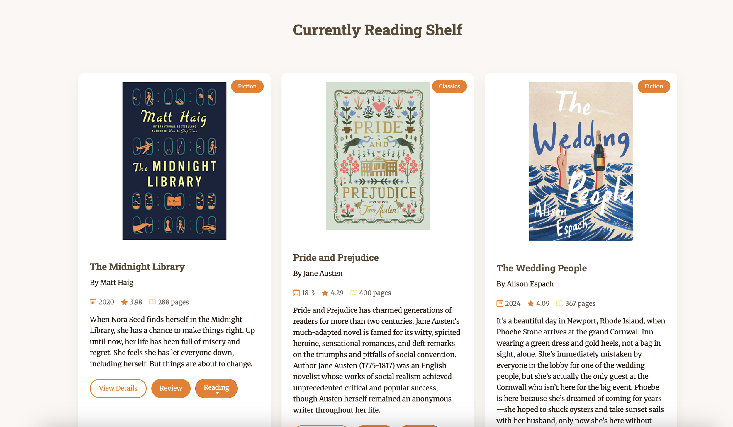
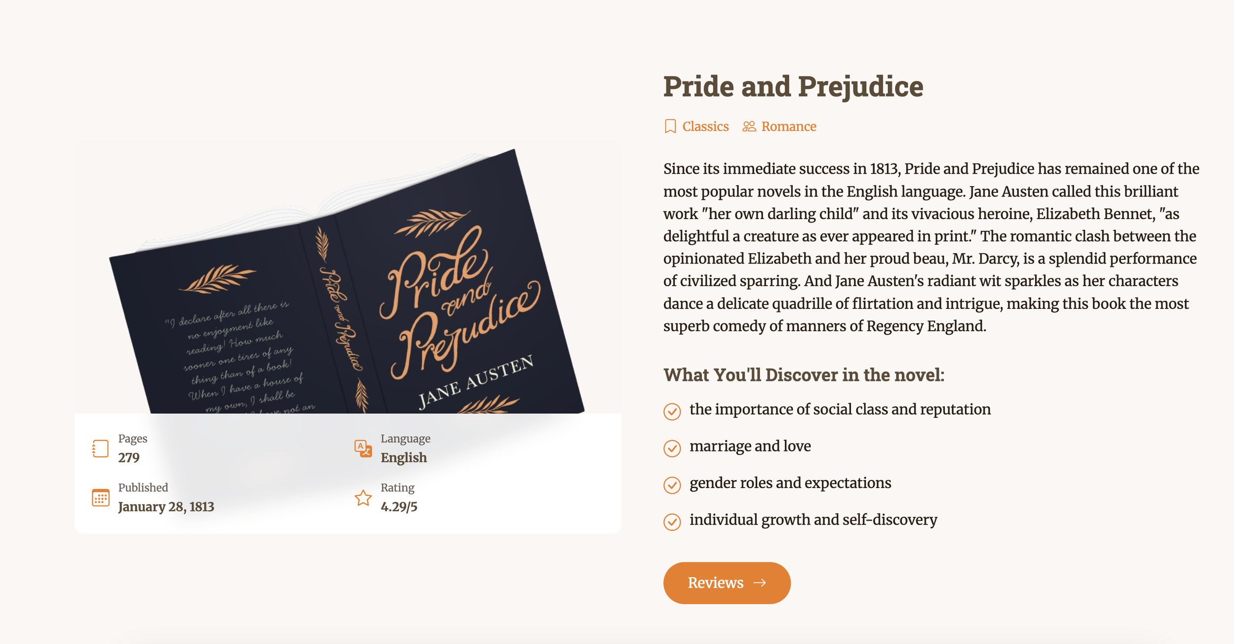
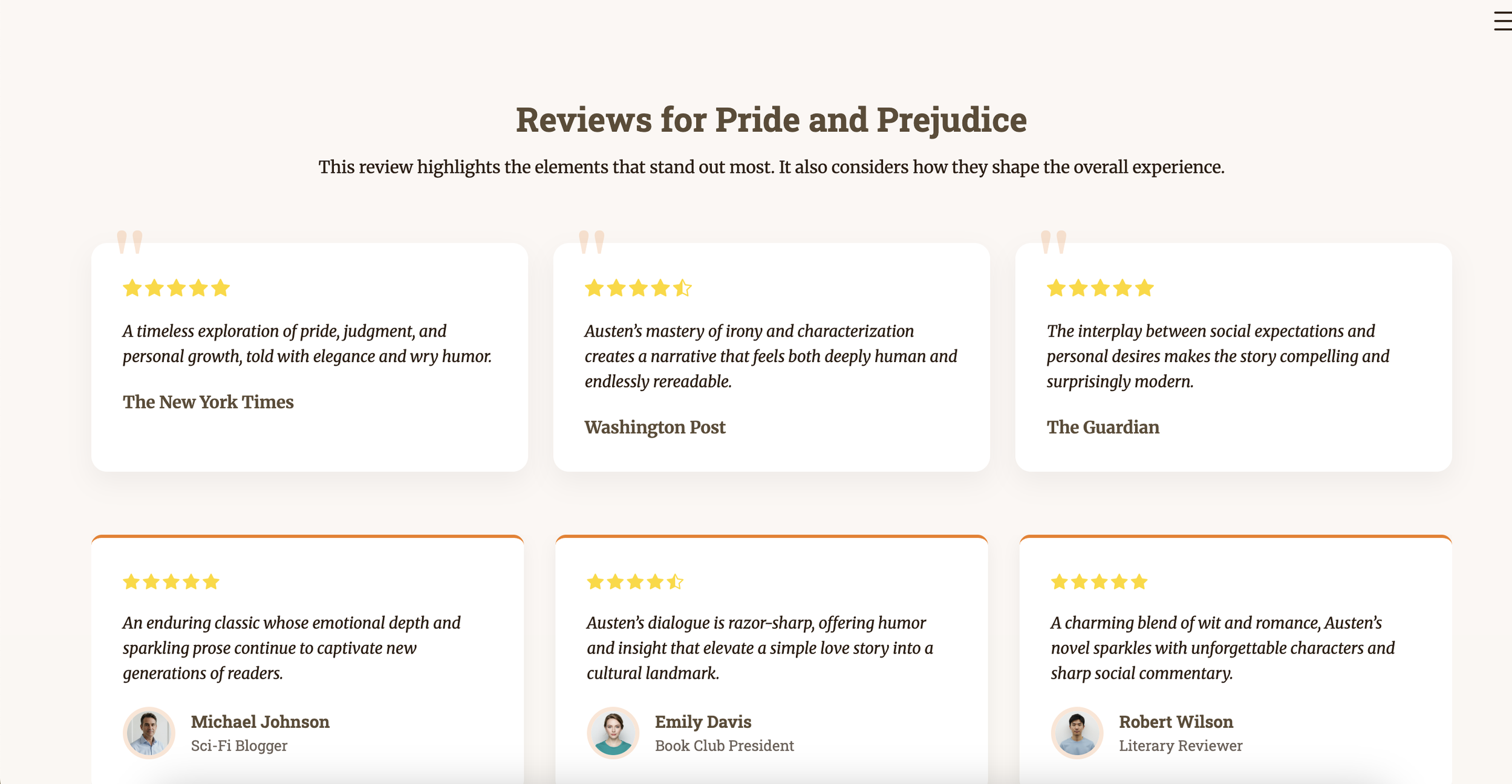
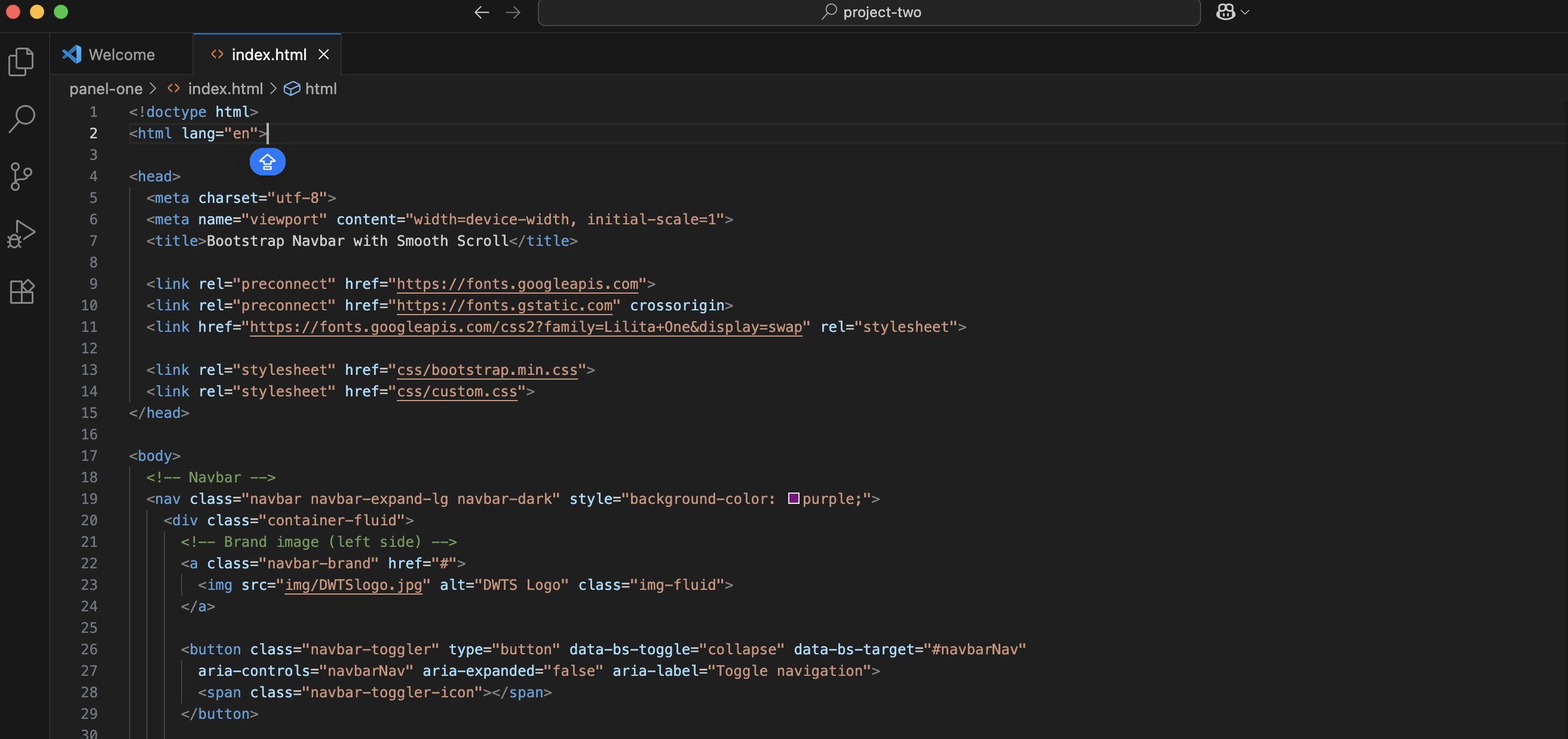
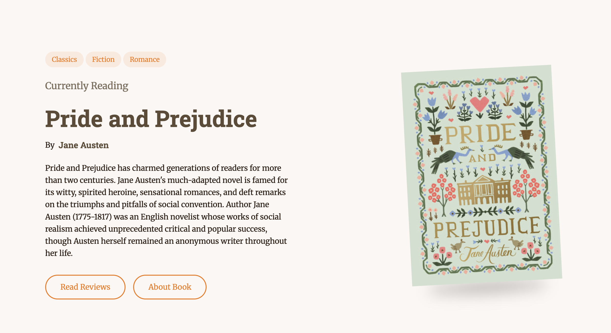
For my speculative redesign of Goodreads, I set out to rebuild a site I know well—but in a way that felt more intuitive, modern, and user-friendly. Initially, I planned to use WordPress as my foundation, but I realized this project was a valuable opportunity to strengthen my Bootstrap skills instead. I started with a pre-built theme to give myself a visual base, then expanded beyond it by researching Bootstrap animations, layout structures, and JavaScript techniques to support new features—especially in the interactive book review section. This approach pushed me to think critically about how users navigate book content and how a cleaner interface could improve their experience.
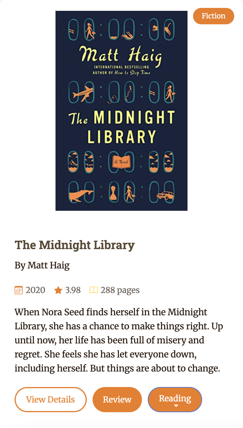
User-Centered Redesign & Simplification
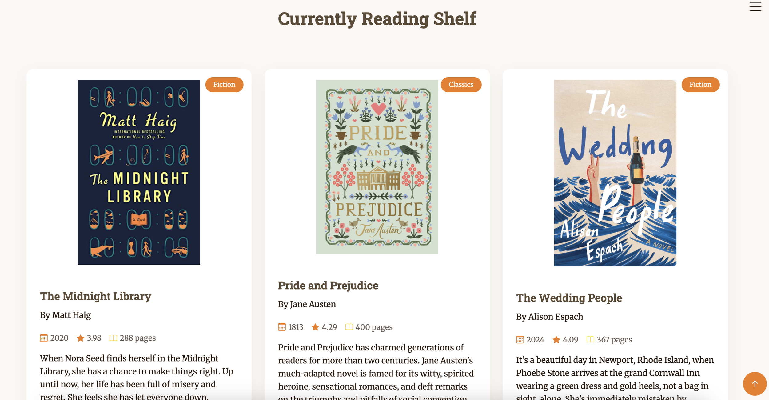
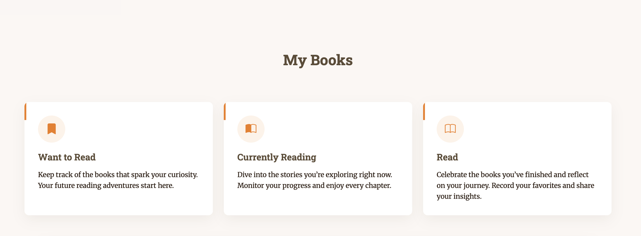
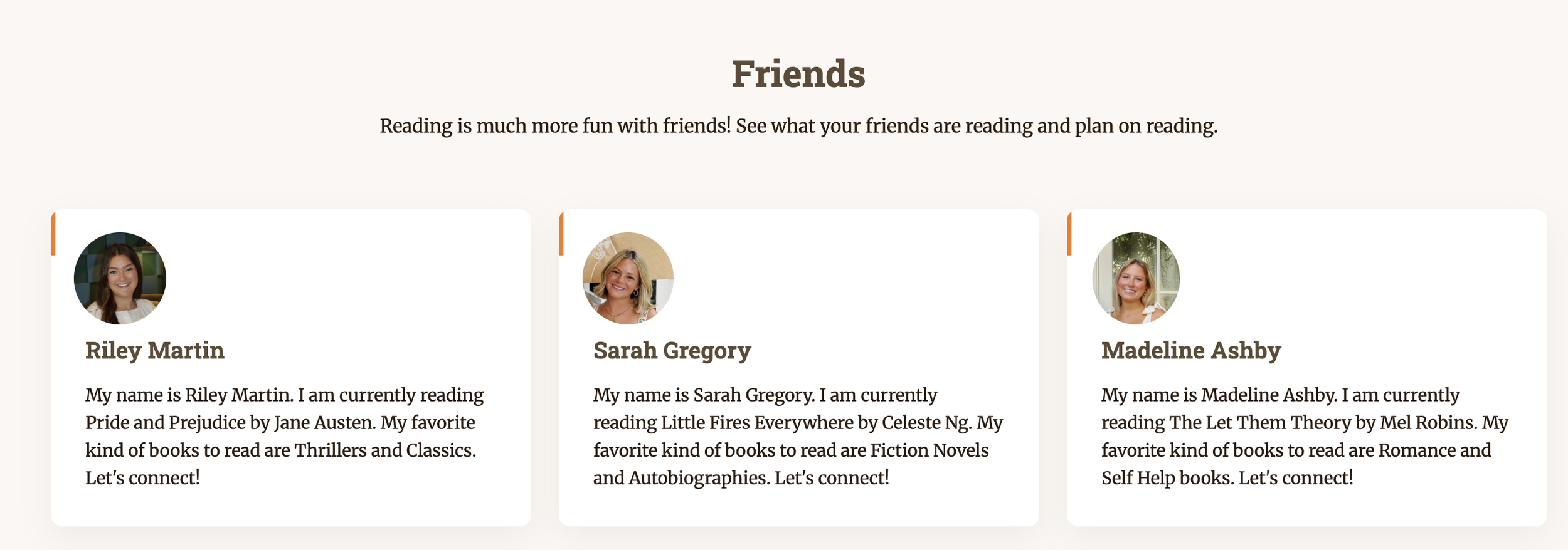
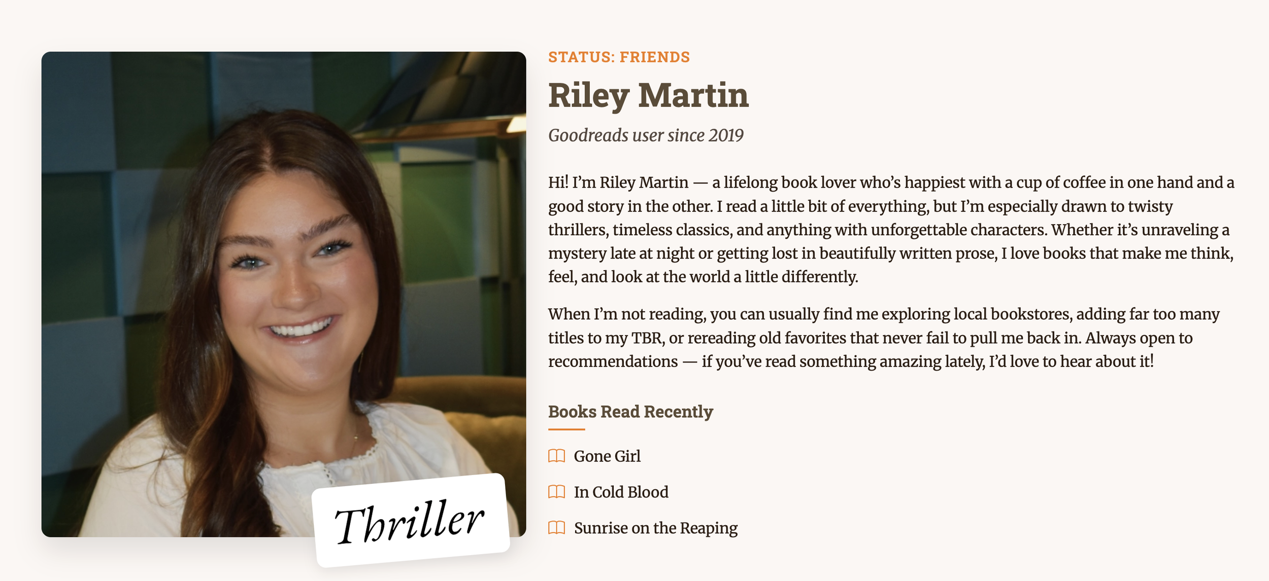
I redesigned the Goodreads experience to be simpler and easier to manage than the real interface, which I had always found cluttered and difficult to navigate. I prioritized clarity, organization, and ease of use, reworking content hierarchy and visual design to better support how readers actually browse, review, and track books. The challenge was balancing added functionality with simplicity. The result was a cleaner, more intuitive design that reflected a deeper understanding of thoughtful, user-centered design.
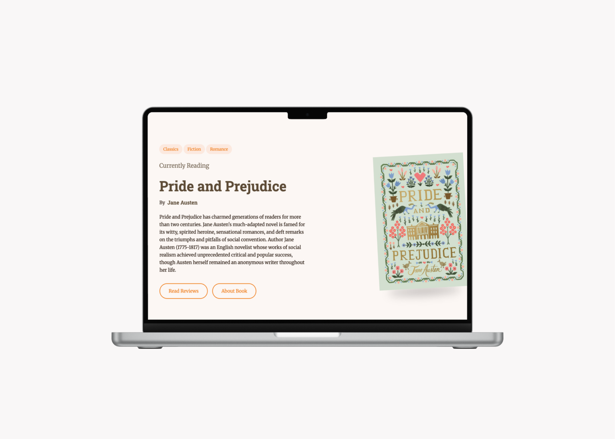
Responsive Multi-Page Development
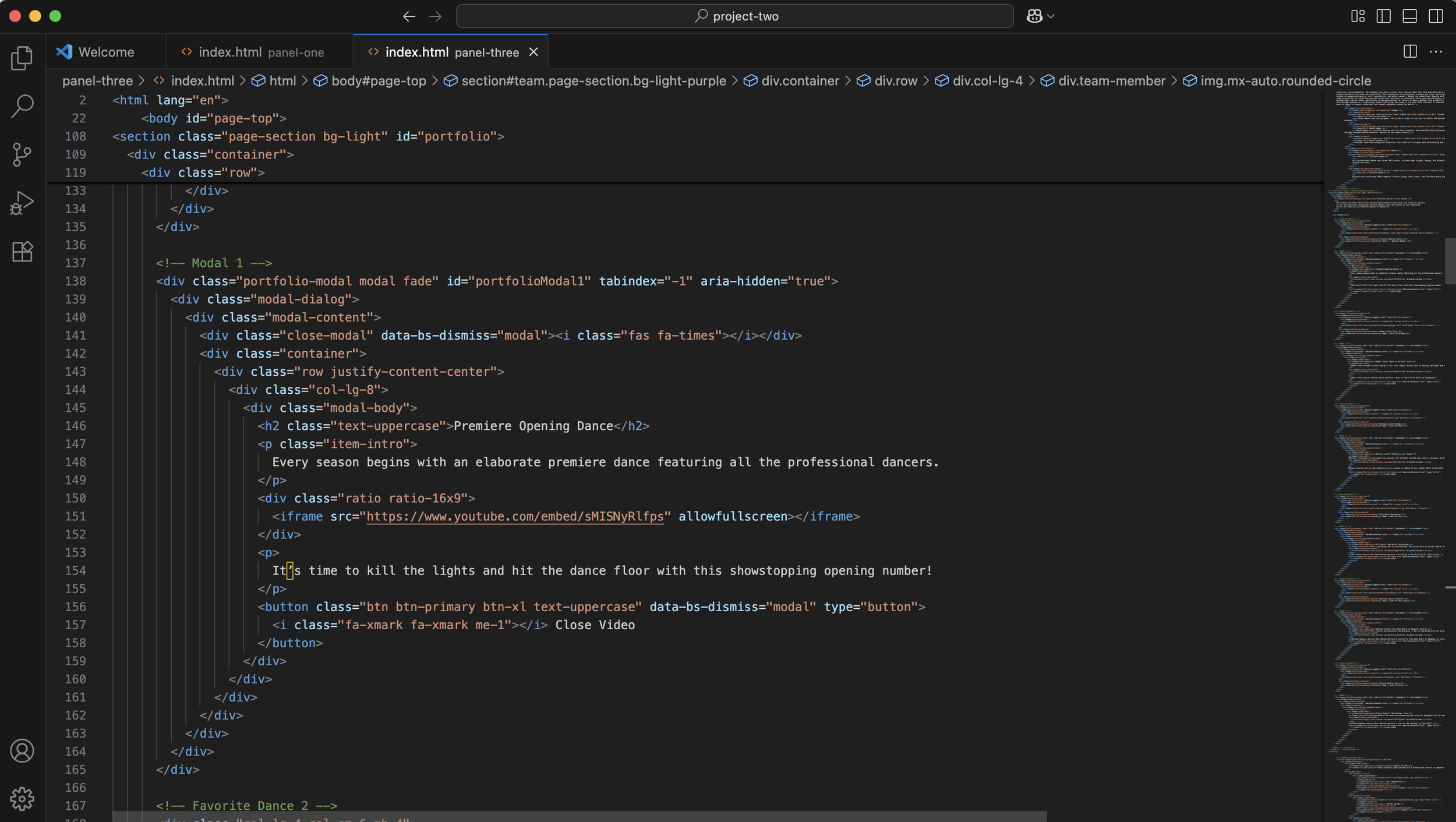
I built a responsive, multi-page site with over 10 interconnected pages using Bootstrap, which allowed for consistent styling and flexible layouts across devices. Managing that many pages while keeping the design cohesive pushed me to improve how I structured code, linked components, and optimized the experience across the site. The result was a unified, easy-to-navigate site that worked well on any screen size.
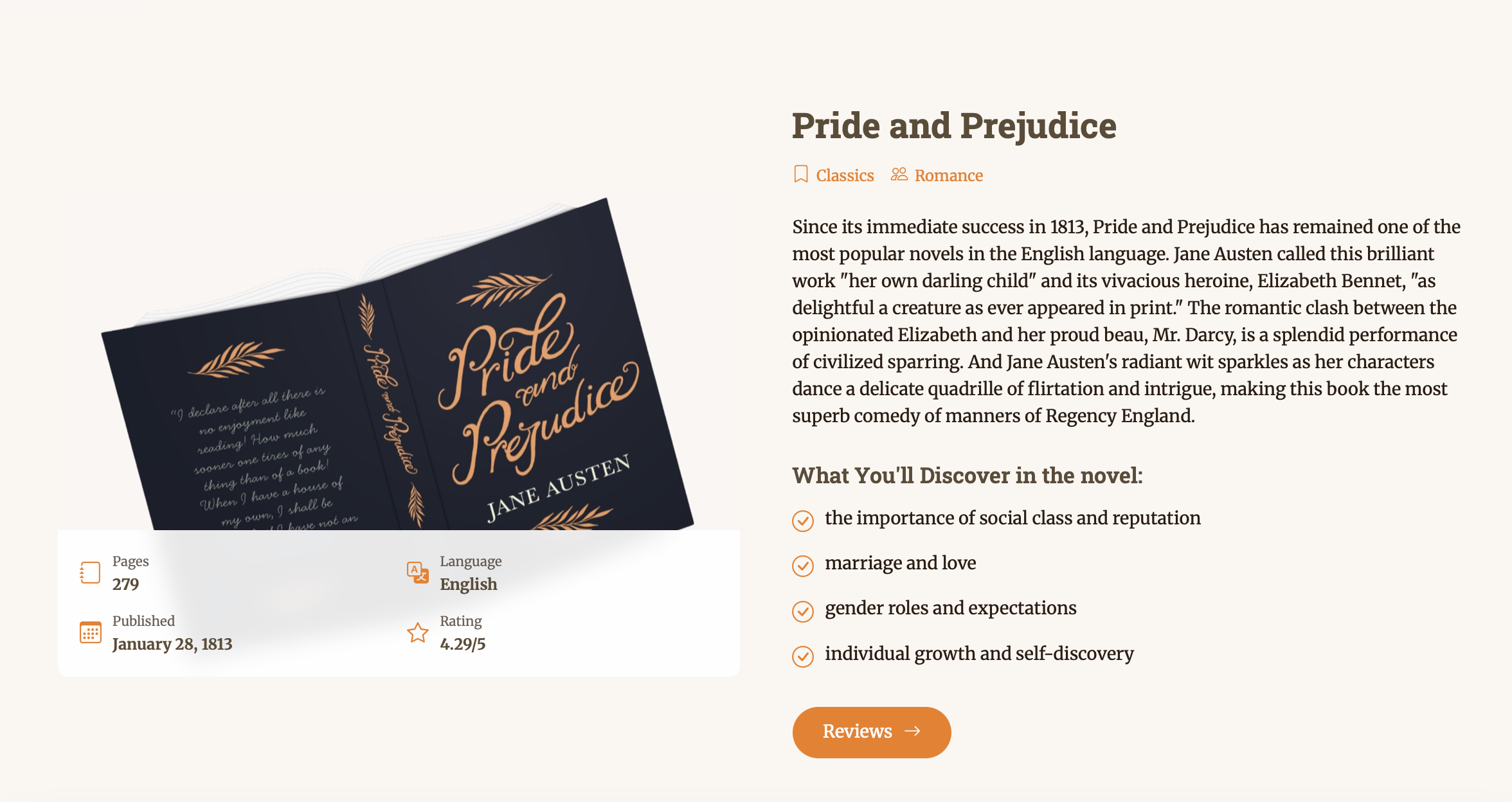
Interactivity & Dynamic Functionality
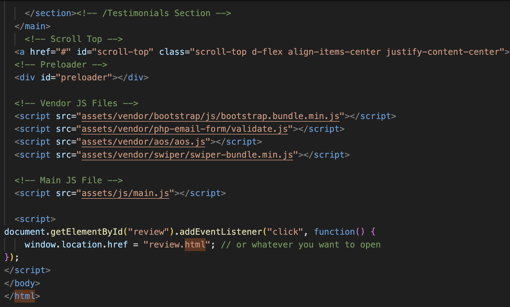
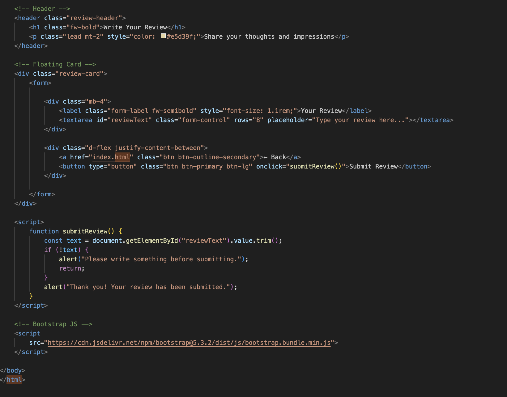
I added animations and interactive elements to enhance user engagement, from hover effects on book cards to smooth page transitions. I used JavaScript to build dynamic features such as filtering book lists, handling user reviews, and managing reading progress, which strengthened my understanding of event handling, DOM manipulation, and state management. Experimenting with coding techniques I hadn’t used before made the project both challenging and rewarding, and it left the site feeling more engaging and functional.
What I learned from the redesign project
This project taught me how to build a site that is both functional and genuinely easy to use. I learned that adding features is easy, but keeping an interface simple while doing so takes careful decisions about hierarchy, layout, and clarity. Working across more than 10 interconnected pages strengthened my ability to structure code, keep styling consistent with Bootstrap, and make sure every page felt like part of one cohesive experience. Building features with JavaScript, like filtering book lists, handling reviews, and tracking reading progress, deepened my understanding of event handling, DOM manipulation, and state management. Experimenting with coding techniques I hadn’t used before also showed me how much I could grow by pushing past what was comfortable. Overall, I came away with stronger technical skills and a deeper understanding of what thoughtful, user-centered design really looks like.
-
UX/UI design
Responsive web design
Front-end development
JavaScript
-
Bootstrap
JavaScript
HTML
CSS